Kimberley Laurence

Kimberley Laurence is a Chinese Medicine practitioner, specialising in women’s health and wellbeing. 

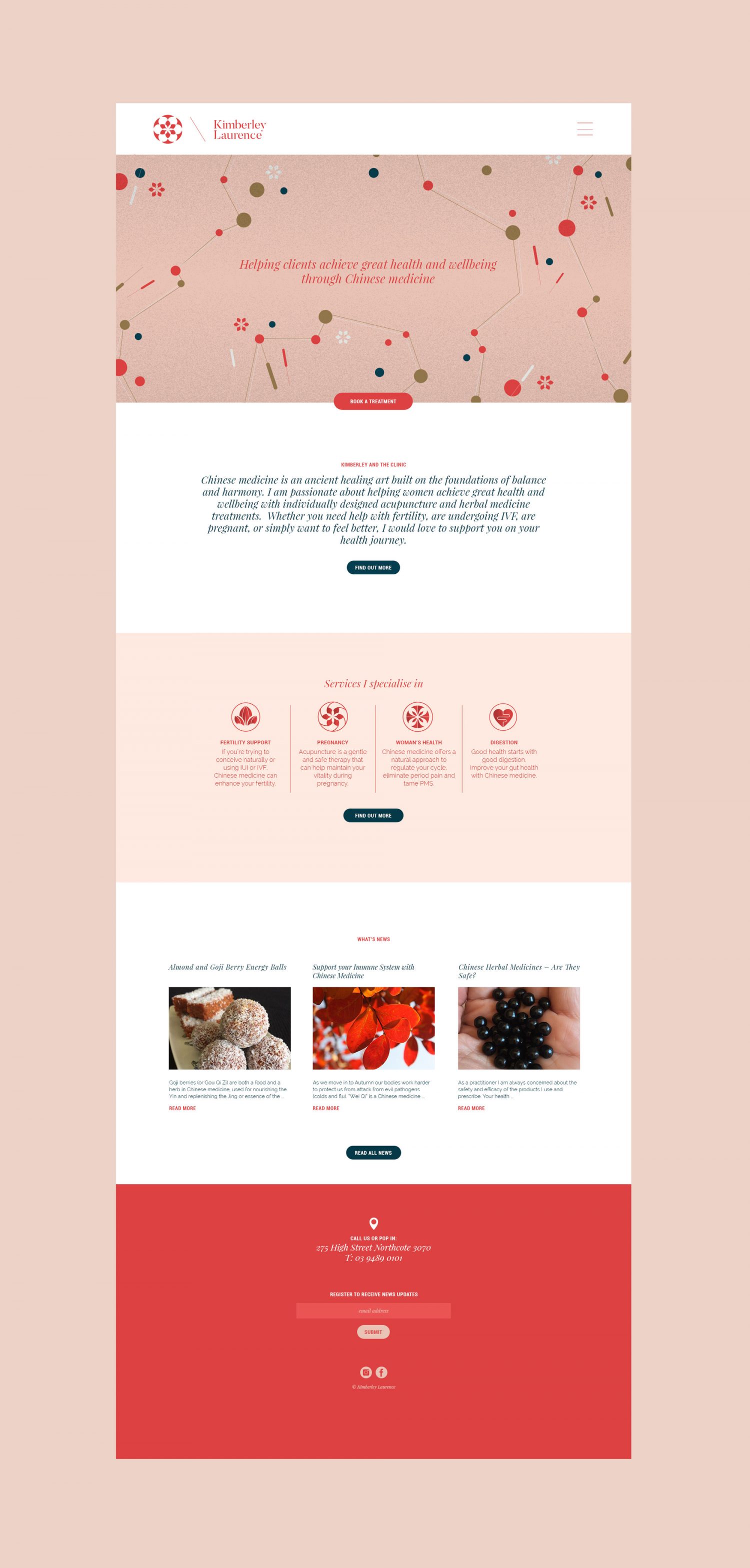
After many years running her business and a new premise on the horizon, Kimberley felt her brand was due for a refresh. Wolf were engaged to create Kimberley’s new brand identity and rollout her entire print and digital suite of collateral. 

WE WORKED WITH - KELLY WATSON, SOLUTIONS PRINT, EFRONT, ALESSANDRO CERUTTI

The concept behind the original brandmark had lovely meaning. It used a pomegranate which is a symbol for health, vitality and fertility – perfectly suited to her target audience. We loved what this symbol represented, so it made perfect sense to us that while we were creating a brand new identity, Kimberley keep this reference in her branding. 

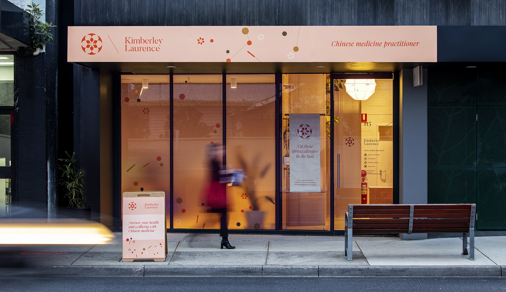
The signage out the front was designed not only to attract attention from local traffic, but to also compliment Kimberley’s professional practice.

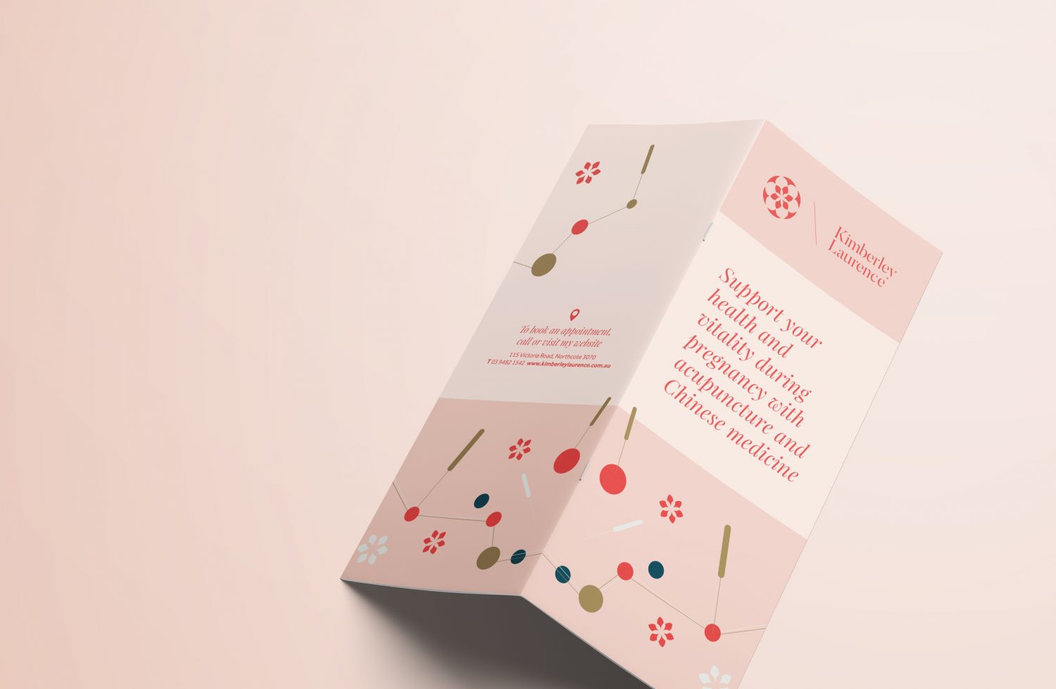
Our illustration drew inspiration from the Chinese medicine understanding of Chee. They believe meridians can be mapped throughout the body, with each meridian having many acupuncture points along its path. The colour pallet was chosen for its warmth and representation of balance after treatment.

What we did:

Brand strategy
Branding and Identity
Signage
Print collateral
UX design
Website design
eDM design